This tutorial is based on a version 2.2.17. Some features might be located differently if you are using a version 2.4 or 2.6
If you already made buttons and icons with rounded corners with GIMP and put a 1 pixel border, you have probably noticed that the rounded parts of the border seem thicker than straight parts ?
An example :

This problem is more apparent with thin borders.
I will show you a tip to avoid this problem, so you will have a result like this :

1- First of all, create a new 80*30 document (it's sufficient for the demo) with white background.
Here is our new document :

Zoom it at 800% so we'll be at ease to work.

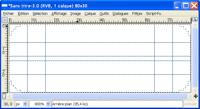
For our technique, we'll need a combination of two rectangle selections and four elliptic selections. For this, we'll have to use guides for our circles.
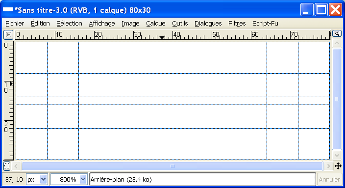
For the demo, I decide that our circles' radius will be 8px long. Set six horizontal guides at 0, 8, 16, 30, 22 and 14, and six vertical guides at 0, 8, 16, 80, 72 and 64.
You should have this :

(note : to have a better view, I disabled the layer boders' display.)
Now, take the Rectangle select tool, select "Add to the current selection"
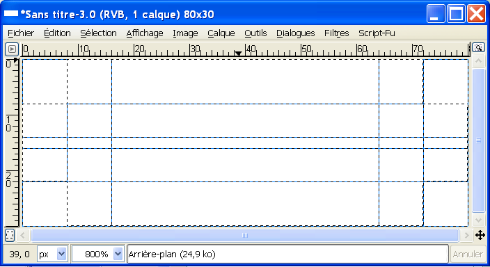
(image) in the tool options, then make two seletions like this :

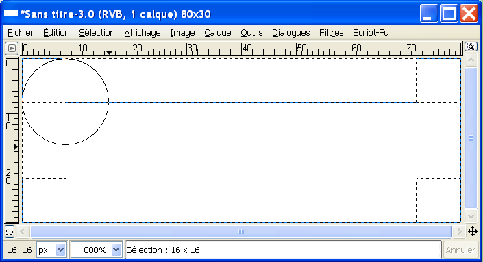
Now, take your elliptic selection, again with "Add to the current selection" in the tool options, then make a first circle starting from the 0,0 coordinates to 16,16, like this :

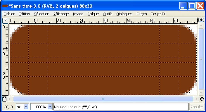
Do the same with the 3 other corners. Now you should have this :

Create a new transparent layer and fill the background with a dark color (ex: maroon).

Disable your selection and create a new transparent layer.
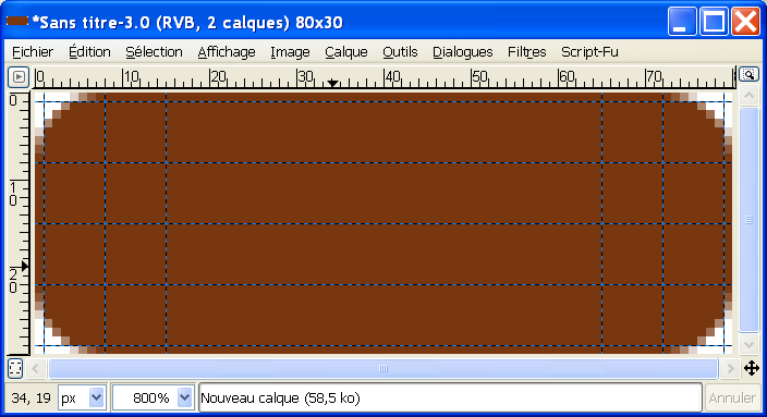
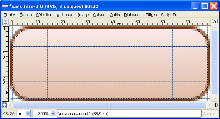
Now, we'll make the inner selection. For this, we'll move the guides who've been used for our circles' borders, in order to shrink the radius. In the horizontal guides, move 1 pixel down the 0 and 14 guides, move 1px up the 16 and 30 guides. For the vertical ones, move 1px right the 0 and 64 guides, and move 1px left the 16 and 80 guides. You should have this :

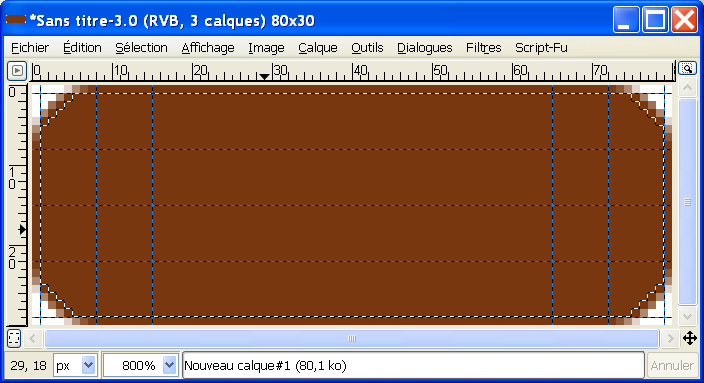
Now, redo the same selections with the rectangle and ellipse selection tool, to obtain this :

Now, fill the new layer with a light color or a slight linear gradient with two light tones, the first should be a little darker than the second :

Disable your selection and the guides' display
Here's the final result with the zoom :

And the real-size result (I enlarged the canva to round the pic with white, to give you a better view) :

The border is nicer, isn't it ? :P


